Designing for Calm: UX Beyond the Screen
An exploration of how subtle interaction, whitespace, and visual pacing shape user emotion.
Date
Category
Writer
In a digital world where attention is fragmented and every second counts, calm is a competitive advantage.
We often think of user experience as a path to functionality. But at Kanso, we believe UX design is also emotional—it can soothe, focus, and even slow down time. The best interfaces don’t just help people do things; they help people feel better while doing them.
Let’s talk about designing for calm.
The Invisible Weight of Digital Overload
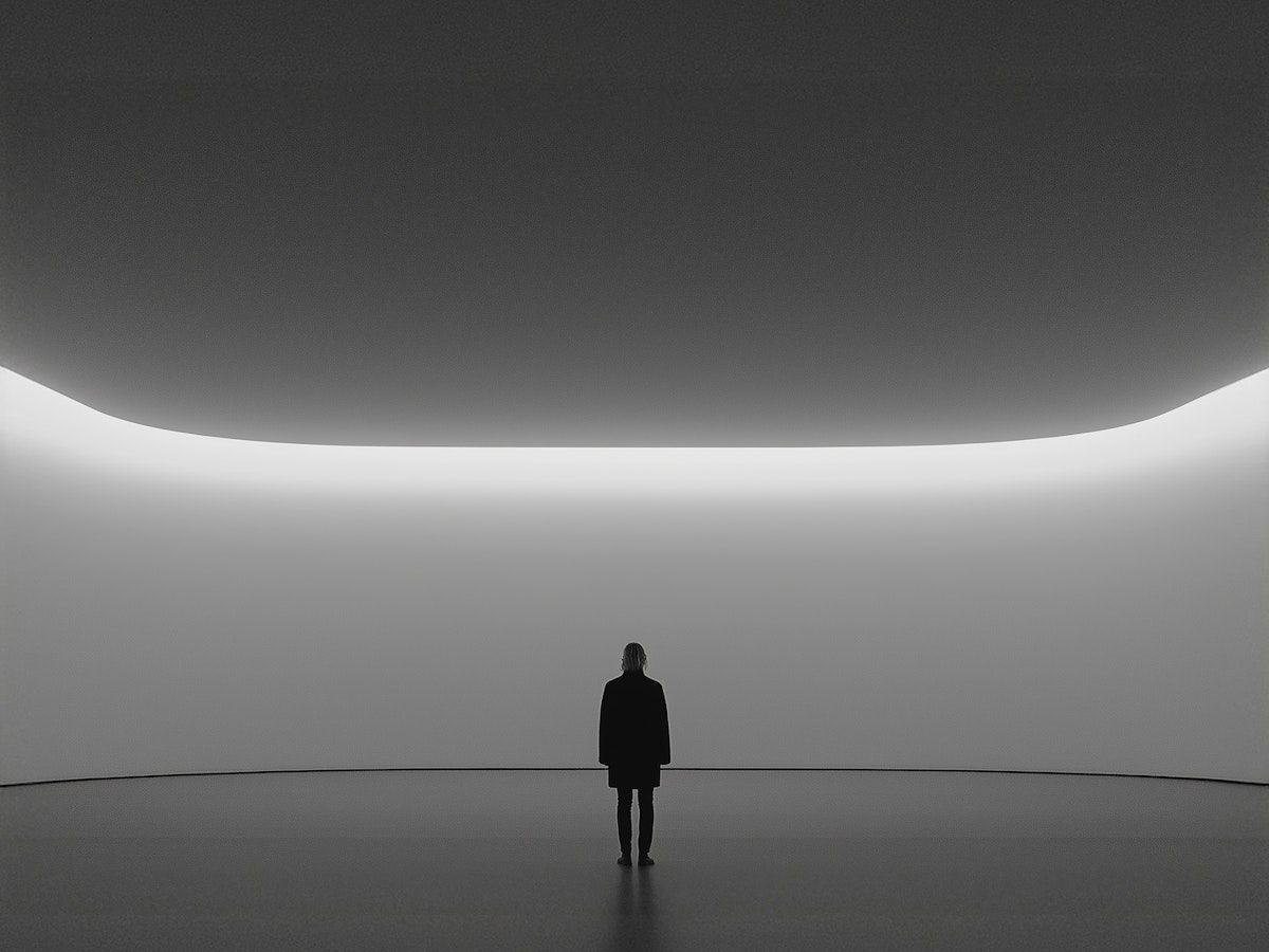
Every day, users navigate through an endless stream of tabs, apps, pop-ups, and notifications. It’s noisy—and even the cleanest interface can become part of the chaos if it’s not thoughtfully designed.
When a product feels chaotic, it demands attention. When it feels calm, it invites trust.
Designing for calm is about reducing friction, not just technically but emotionally. It’s about creating space—both visually and cognitively—for the user to move with clarity and control.
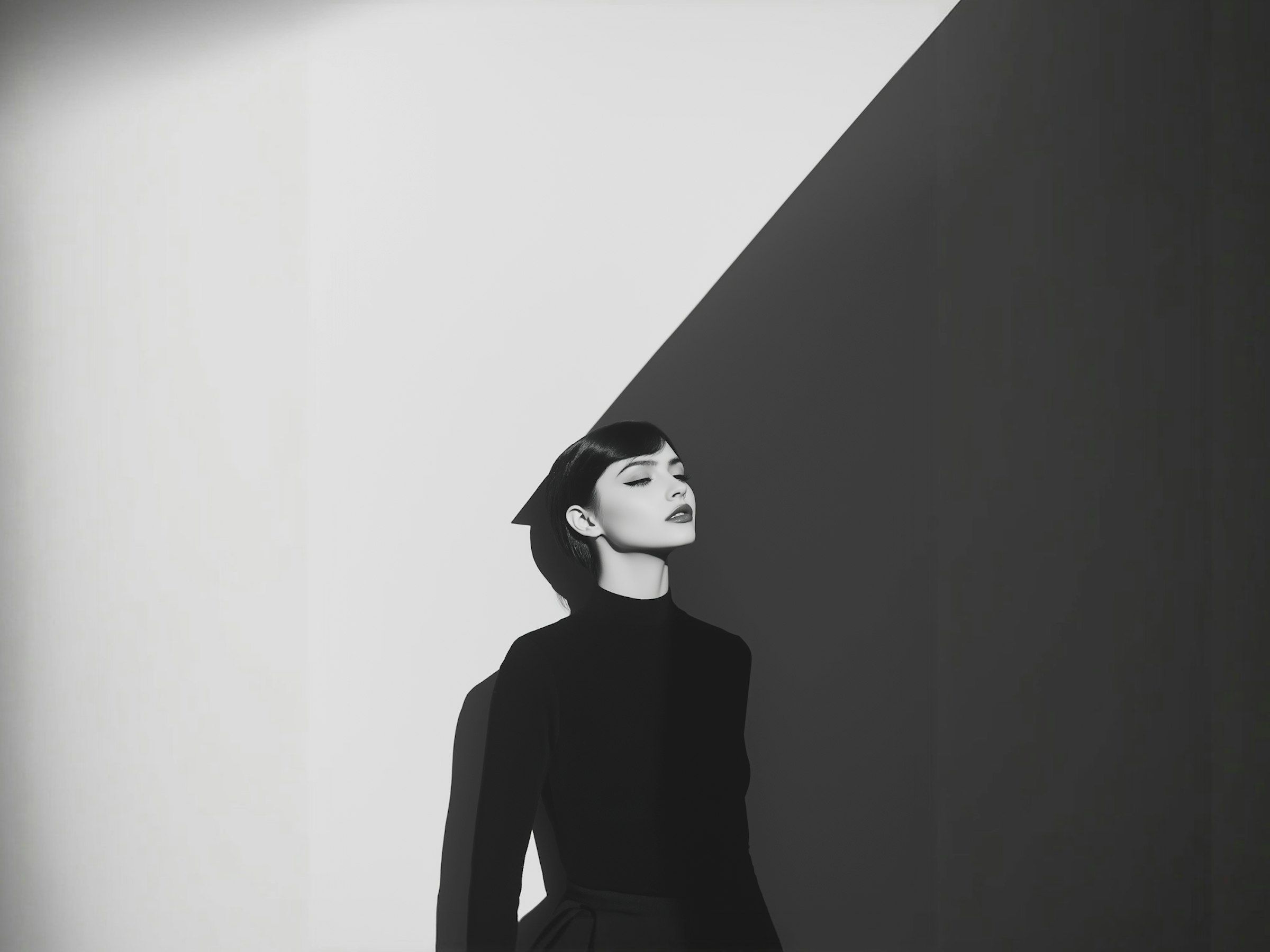
Whitespace as Breathing Room
Whitespace is often mistaken as just “empty space.” But in calm design, it’s active. It gives rhythm to content, focus to interactions, and lightness to heavy ideas.
When used intentionally, whitespace isn’t just aesthetic—it guides. It slows down the scroll. It creates visual priority. It allows the user to take a moment, instead of rushing forward.
In an app or site that’s designed for calm, whitespace doesn’t feel like an absence. It feels like a breath.
Typography that Guides, Not Distracts
Typography is a silent carrier of emotion. Calm design favors type that is readable, balanced, and composed. It’s not shouting at the user—it’s speaking clearly.
Hierarchy, spacing, and consistency are key. By giving users a predictable visual language, we reduce micro-decisions and lower cognitive load. Less effort. More ease.
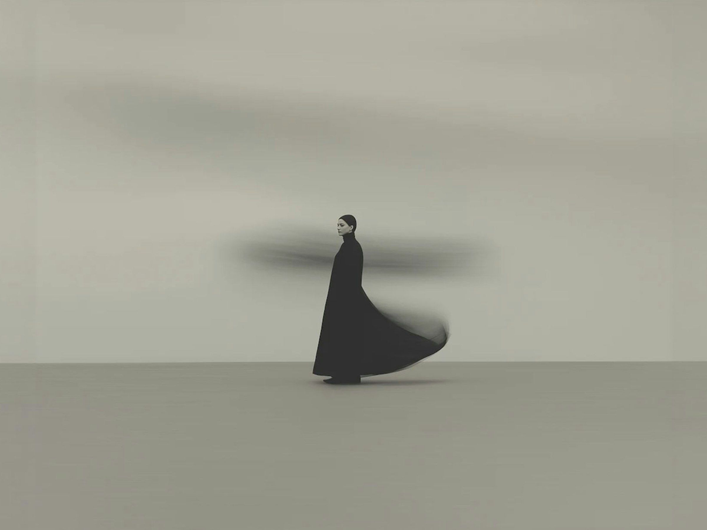
Motion with Meaning
Motion, when used sparingly, enhances calm. Think of a soft page transition, a loading indicator that gently fades, or a hover state that subtly acknowledges presence.
But motion should never be used for decoration alone—it must serve a purpose: orient the user, confirm an action, or reduce perceived waiting time. Overuse of animation does the opposite of calming—it distracts, confuses, and overwhelms.
Tone That Respects Attention
Designing for calm also means choosing words wisely. Microcopy, labels, and calls to action should be clear, friendly, and respectful. No urgency. No overload. Just simple guidance.
Your interface shouldn’t feel like a salesperson. It should feel like a guide—quiet, confident, and helpful.
Beyond the Screen: Calm is a Brand Value
When calm becomes part of your digital experience, it becomes part of your brand. It reflects a deeper commitment to user well-being, focus, and trust. In industries like wellness, fintech, and education, this emotional layer can be the difference between fleeting visits and long-term loyalty.
At Kanso, we design digital experiences that don’t just work—but feel good to use. Because when users feel calm, they stay. And when they stay, they engage with intention.
Latest Articles.
© Kanso Studio
Thoughts, ideas, and perspectives on design, simplicity, and creative process.